
Redesigning WD-40 Cans
For Retail Impact
Objectives
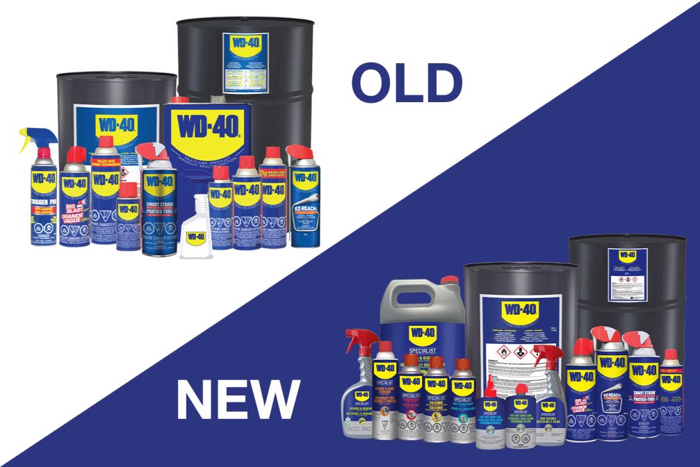
WD-40, a globally recognized household name known for its versatility, faced a challenge on retail shelves. While the signature blue can carry decades of brand equity, its packaging had become visually cluttered due to an overload of regulatory warnings and inconsistent design elements. This compromised its shelf impact, especially in an era where consumers make split-second decisions based on visual cues. The objective was clear: redesign the WD-40 to retain its recognizability while improving its clarity, compliance integration, and consumer appeal.
The project aimed to modernize the design without losing the product’s essence. We needed a solution to simplify the communication of product use cases, adhere to regulatory requirements, and elevate the aesthetic to better compete in today’s design-forward retail environment.
Solution
Our approach began with comprehensive research, both competitive and consumer-facing. We conducted an in-depth packaging audit across similar multi-use products and conducted qualitative interviews with long-time users and potential new customers. These insights guided a strategy that combined design thinking with compliance requirements.
The design process focused on transforming the can into a visually engaging and informative tool. First, we developed custom iconography to convey the product’s multiple applications clearly. These icons were designed to be simple, clean, and universally understandable. Next, we tackled the regulatory challenges by reimagining warnings not as afterthoughts but as integrated design features, streamlined within the overall layout to ensure visual harmony.
Color hierarchy and spacing were optimized to build a visual flow, drawing attention to branding and functionality. We adopted a modular approach to content layout, allowing key information to be immediately scannable. Multiple design iterations were tested with both internal stakeholders and external users, refining each round to strike the perfect balance between form and function.
Results
The final packaging met compliance standards and redefined how regulatory-heavy products can still be beautifully presented. The redesign preserved WD-40’s brand heritage while infusing it with a modern identity, resonating with loyal users and a new generation of consumers.
*
Improved Shelf Presence
The new design helped the can visually stand out, increasing retail engagement.
*
User-Friendly Communication
Streamlined iconography allowed users to understand key product benefits and use cases instantly.
*
Design-Led Compliance
Regulatory information was cleanly integrated without overwhelming the layout or design integrity.
*
Positive Market Response
Feedback from retail partners and consumers highlighted a strong appreciation for the cleaner, more professional appearance.